 and Finn Banbury. Photo: Courtesy of CCA")
Recently, we noticed something we previously wouldn’t have paid attention to: a young woman standing near the 16th Street Boba Guys order counter quietly flipping through The Potrero View. Watching her read the paper on an ordinary afternoon made the work we did as California College of the Arts (CCA) students this last semester feel tangible. After extensive research, countless InDesign drafts, and many late nights, the issue we helped design appeared to have attracted a new reader to the View, which in turn connected them to the wider community.
Our redesign of The Potrero View was never about dramatic transformation but about building upon a strong foundation. The View has a long history, and as young students who have only lived in the neighborhood for three years, we felt unsure as to whether we could understand the paper’s essential meaning to its readers, let alone redesign it. We reviewed previous issues, online articles about the paper’s history, its website, and Instagram account, but didn’t really know where to begin our restyling.
Catie Magee, the View’s accounting manager, reframed the project for us. The View isn’t simply a publication. It strengthens connections within the neighborhood. Unlike the speculative publications we’d designed in previous classes, this work was real: the paper, its audience, and its community values. Then the publisher, Steven Moss, posed an unsettling but straightforward question: What’s the point of having a print newspaper in this day and age?
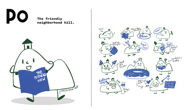
We began to reimagine The Potrero View not just as a newspaper, but as an entire ecosystem, with the potential for a more expansive digital presence, physical extensions, and moments of interaction beyond the page. One idea stood out: a neighborhood mascot that could carry the paper’s brand across platforms.
For the paper itself, we created bold, visually striking front pages, but none really functioned for a newspaper. We produced three possibilities and introduced “Po,” a View mascot that could extend the paper beyond the page. Moss’s response was clear; each direction altered the paper too radically. In trying to make it new, we risked losing what longtime readers relied on: clarity, familiarity, and trust. Po, however, was attractive because it contrasted with the paper’s seriousness while embracing the neighborhood’s quirkiness, locality, and warmth.
Our professor, Eric Heiman, encouraged us to look closely at what already existed: the masthead, sturdy typography anchoring each page, index bar that guides readers through the paper. Don’t start from scratch. Surgically retool what’s already there. Focus on making useful changes, not just new ones.
We began with the masthead, cleaning up small details that connected the letterforms to reflect the View’s communal role. We collaborated with local illustrator, Chloe DeBruynkops, to redraw the image behind the typography, preserving its original character while updating its colors and forms to feel more current. We selected new typefaces to improve readability and a more expansive grid to increase design flexibility. We also introduced a “dingbat” font – created by local type designer Bob Aufuldish – to add personality and guide readers from page to page.
Then we had to apply this system to an actual issue. Content was constantly in flux: copy was edited, headlines changed, images arrived. We had to respond to every update while still refining the overall design system. But the issue quickly took shape; we sent the final files to the printer just before Thanksgiving.
On a Saturday afternoon, a week or so later, a friend sent us a photograph of a freshly printed December issue they picked up in the neighborhood. Seeing the paper out in the world, something to be held, read, and distributed in boxes and at stores… it felt like a release! The work had left our screens and entered the hands of the people for whom it was intended.
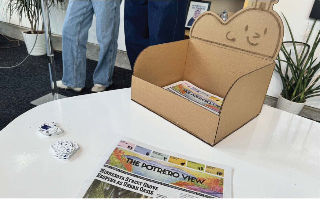
We used our remaining time to give our mascot, Po, a backstory, personality traits, and a consistent visual language that could respond to its different contexts. We prototyped a newspaper box designed to sit on the shelves at Farley’s Coffee, and designed Po stickers for anyone who picked up a copy of the View. (Coming soon!)
We began this project thinking we were redesigning a newspaper. What we found instead was a larger world beyond the printed page; characters, physical touchpoints, and small moments of interaction woven into the neighborhood. The December issue, Po the mascot, and the gestures that accompany them are not final statements, but opening notes. They set a tone, introduce possibilities, and invite continuation.
The View has always been shaped by the people who read it, write for it, and carry it through Potrero Hill. Our hope is that the work adds a few new lines to this ongoing composition of The Potrero View, one that will continue to unfold.
TBD* is a CCA course that pairs undergraduate Communication Design students with local organizations to help with their design needs. When The Potrero View’s editor-in-chief Steven Moss’s TBD* application came in, Professor Heiman was instantly intrigued. He’s always looking for ways that TBD* can engage with its immediate neighborhood, and the chance to rethink a longtime local newspaper was too good an opportunity to pass up.
Photo, top: CCA Students Lucie Tran (left) and Finn Banbury. Photo: Courtesy of CCA