The excavator’s articulated yellow boom-arm rose slowly, hoisting the six-foot tall letter ‘n’ off the flatbed trailer into the air, a thick strap shackled to a threaded steel eyelet. The hole had been bored into the top of the concrete letter more than 40 years ago; it could no longer bear its own weight for long. When the excavator cab swiveled just a tad too quickly, the suspended ‘n’ sailed out in a wide arc. The eyelet tore loose; the one-ton letter plunged with a ‘thud’ in the soft dirt, tumbling forward into a shallow ditch next to a capital ‘B’ and lowercase ‘d.’ A worker – protected only by a white plastic helmet, N9 facemask, and yellow reflective vest – leapt back as the letter dropped at his feet. He cautiously eyed the damage.
“It’s fine,” he shouted. “No cracks.”
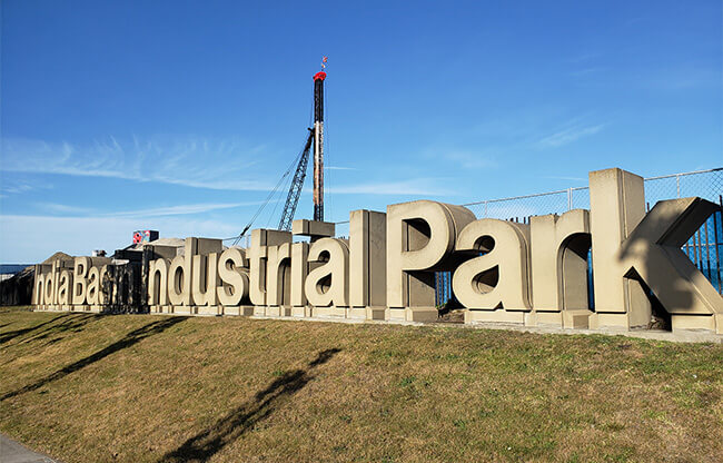
There were more concrete letters written across a grassy berm along Third Street, which altogether had once spelt “India Basin Industrial Park.” By the end of the day all would be removed.
The concrete slabs were created by San Francisco artist and designer Michael Manwaring, erected in Bayview in 1978. They were swept away as part of demolition of the India Basin Industrial Park to accommodate a new Southeast Community Center. The Center, which had been on Oakdale Avenue, had to be relocated to make way for an expanded wastewater treatment plant. It moved to a centrally located, five-acre parcel less than a mile away, across from the Bayview Shopping Plaza and a T-Line rail stop.
Manwaring’s letters, reflective of the 1970’s “Supergraphic Movement” – sparked in Northern California by the large graphics Bay Area designer Barbara Stauffacher Solomon created for Sea Ranch’s athletic center, a bigness and boldness that neatly fit that decade’s exuberance and design excesses – may be lost forever.
Manwaring grew up near Stanford University, where his father taught. Art wasn’t encouraged at home; he expressed his creative talents on his high school classmate’s car, painting stripes and jagged flames.
“My friend and I were cruising around San Bruno and I saw people turn and stare as we drove past,” Manwaring remembered. “So, I told my friend to let me out so I could watch him drive up and down the street. I wanted to feel the effect of my design on the viewer. It was my first encounter with the idea of public art.”
Manwaring’s father declined to pay for art school. Manwaring took a job driving a delivery truck in Palo Alto. Fearing his son would never receive a post-high school education, his dad relented. In 1961, Michael was accepted into the San Francisco Art Institute’s graphic design department.
“Graphic design was looked down on by most of the other art students,” Manwaring said. “It was considered too commercial. I was pretty disappointed in my choice and considered leaving.”
In his second semester a new teacher, Jim Robertson, head of a San Francisco design firm, took over Manwaring’s class. Robertson looked at the students’ first semester work and declared it “a pile of crap.” In what became a pivotal moment in Manwaring’s life, he stood up to the teacher, asserting that design wasn’t real art anyhow. Robertson countered by challenging Manwaring to examine the works of European designers, among them Swiss creator Josef Muller-Brockmann. Manwaring discovered what’s known as the ‘Beethoven poster,’ the Muller-Brockmann piece from 1955 that changed perceptions of modern design. Manwaring learned that stripped of text and advertising elements, great design could be great art.
“It was so free and beautiful,” Manwaring said. “Better than any painting I had seen at the Institute.”
“Butchertown,” as Bayview was once known, was a center of industrial activity during World War II, a destination for the Great Migration, a movement that brought African American families from the American South to work in militarized factories and shipyards. Bayview became an economic powerhouse, a cultural center of the Black community, with wartime jobs offering living wages to skilled and unskilled workers.
Within a generation of the war’s end, however, many manufacturing jobs followed returning White general infantrymen to the suburbs. ‘White flight’ meant a loss of jobs, and a barrage of racially segregated fiscal and civic policies, leaving behind economic devastation and urban decay.
In 1965, the mood in Hunters Point was tense. Following the killing of 16-year-old Matthew Johnson by a police officer, the community exploded into what became four days of protest and violence. The National Guard patrolled the streets. Local resistance was hardly unique; from Baltimore to Chicago, New York to Los Angeles, Black communities that’d been left behind in the economic boom that followed the War made their indignation known.
The uprising signaled to the City’s Board of Supervisors that with impending closure of the Hunters Point Naval shipyard, and without new job opportunities directed at Bayview-Hunters Point, poverty and unrest would continue to plague the community. On January 20, 1969, the City adopted a redevelopment plan for Hunters Point which included the India Basin Industrial Park, a manufacturing and training center that was intended to bring jobs, educational opportunities, and a revitalized economy back to the neighborhood.
In 1976 Bob Le Rocca’s landscaping business was hired by the City to design the industrial park’s surrounding scenery. With a meager budget, he begged Manwaring to create a modest sign to mark India Basin’s entrance.
“I think that $2,500 was for the design and the production,” Manwaring said. “Bob had already been turned down by everyone, but I had just launched my own design business and I needed to get busy, so I took it.”
Manwaring sketched a few ideas. Everything he came up with felt wrong for the wide-open space. Then he remembered the advice he’d gotten from Staufacher Solomon; if something wasn’t working it probably wasn’t big enough. The scale grew, emerging as a six-by-four-by-four concrete sculpture made of 24 letters, a Supergraphics sign.
“I chose to work in Helvetica font,” Manwaring said. “Today that seems obvious, but at the time Helvetica was revolutionary. It was the most important font ever created. The lowercase letters are beautiful, and elegantly support the capitals.”
Manwaring used a combination of capitals and lowercase; he felt a row of capital letters standing between the street and industrial park would overwhelm the viewer, like a wall, unwelcoming.
Once the style and scale had been established, Manwaring made another big decision; to make each letter a free-standing, three-dimensional, sculpture.
Robert Indiana had experimented with text as art in his famous 1970 sculpture that depicts the word ‘LOVE.’ Manwaring incorporated the idea of large three-dimensional letters being used, but in this case in a practical application. Combining creativity into an applied form has informed much of Manwaring’s design work for more than three decades.
“In America we find that art displayed in public spaces is usually advertising,” Manwaring said. “Cities in Europe have a long history of incorporating art and design into public projects. That was what I wanted this sign to be, public art.”
Le Rocca loved it so much he convinced the City’s project managers to increase the budget to accommodate a more expensive gateway design, adding a 700 foot berm, or mound, running the length of the property, covering it with grass and trees to frame the letters. The much larger, more prominent design was more than sign; it defined the entrance to India Basin for years to come.
Now the land has been leveled. The skeletal structure for the new Southeast Community Center has been erected. The Manwaring letters, at one point slated to be demolished, are being stored in a pit on the edge of the property thanks to the efforts of Emily Rogers-Pharr, the Center’s new director.
“Every brick in Bayview has a history to someone,” Rogers-Pharr said. “We did not want to move forward with our project until we had reached out to all community members.”
Residents asked the San Francisco Recreation and Park Department to relocate the letters, at least some of them, to India Basin Park, just a mile away, so far with no response. BUILD SF has agreed to store the letters on its land, with no promises to integrate them into the new 1,500-unit residential complex its constructing along the waterfront.
